Visualizing potential solar PV generation vs smart meter electricity usage
For many years now, energy suppliers have been rolling out “smart meters” to home across the UK. It has largely been promoted as a way to let consumers reduce their consumption by watching their energy usage on an in home display (IHD) gadget. This is massively under selling the potential benefits of smart meters, and combined with various other reasons, leaves many unenthusiastic about the change. A few more adventurous suppliers, most prominently Octopus Energy, are taking advantage of smart meters to offer innovative dynamic tariffs, which particularly benefit those with electric vehicles.
I have been exploring the possibility of a solar PV installation at home and after talking to various suppliers have been left feeling quite underwhelmed with the reports they provide with their quotations. Typically a selection of crude 2-dimensional charts showing potential generation per month and some rough estimate of how much grid import will be reduced and grid export available based on your yearly kwh usage figure. They’ll only illustrate one or two scenarios, so it is hard to understand the impact of altering the number of panels requested, or sizing of any battery storage.
The European PVGIS service provides a good site where you can visualize the solar generation at your home based on actual recorded atmospheric conditions from history (typically their data lags current day by 2-3 years). They still only make use of your yearly kwh consumption figure with a generic model to estimate benefits. With a smart meter I have historic electricity consumption for my home in kwh at 30 minute granularity. Match that against the PVGIS data and its possible to produce a fine grained simulation of solar PV generation potential against consumption.
And so came forth the idea of a simple python script I’m calling “smartsolar” to combine PVGIS data with smart meter data and produce reports evaluating potential deployment options. It can use smart meter records downloaded from n3rgy (compatible with any UK supplier once registered), or from Octopus Energy‘s customer portal. Using plotly the reports contain 3-dimensional interactive charts showing data day-by-day, hour-by-hour. Changing the configuration file lets you quickly evaluate many different deployment scenarios to understand the tradeoffs involved.
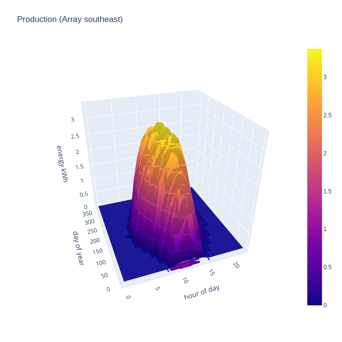
In the charts (screenshots of a fixed POV only, non-interactive) that follow I’m evaluating an arbitrary installation with 10 panels on a south-east orientation and 6 panels on a north-west orientation, panels rated at 400W, along with 10 kwh of battery storage. The smart meter consumption data covers primarily 2023, while the PVGIS generation data is from 2019, the latest currently available.
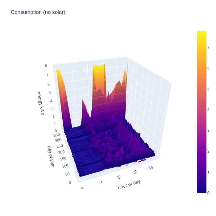
The first chart shows the breakdown of consumption data and exposes some interesting points. The consumption is broadly consistent from day-to-day across the whole year and is spread fairly flat across the time period from 8am to 11pm. This reflects the effects of full time remote working. Someone office based would likely see consumption skewed towards the evenings with less in the middle of the day. The enormous nighttime peaks in consumption in the last month of the year reflect the fact that I acquired an electric vehicle and started charging it at home on a Zappi. The huge day time usage peak was a side effect of replacing our heating system in Dec, which required temporary use of electric heaters. NB, the flat consumption around Sept timeframe is a result of me accidentally loosing about 25 days of smart meter data.
The next two charts give the real world PV generation of the two hypothesized solar arrays, based on the 2019 PVGIS data source. The larger south east facing array starts generating as early as 5am in the middle of summer, but drops off sharply around 3pm. There is still useful generation in mid-winter from 8am till around 2pm, but obviously the magnitude is far below summer peak.
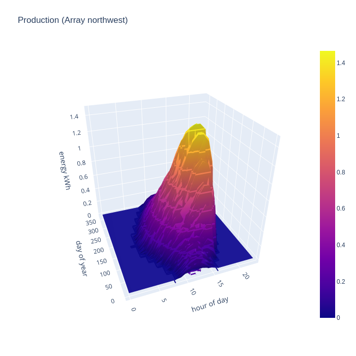
Conventional wisdom is that PV is a waste of time on predominantly north facing roofs, but what is the real world performance like ? The small north west facing array shows a gradual ramp in mid-summer from 6am to reach a peak at around 6pm, and drops off to nothing by 8pm. For the 2 months either side of mid-winter, the generation is so negligible to be called zero. The absolute peak is 1/2 that of the south-east array, but there are 10 panels south east and only 6 panels north west. So peak generation per panel is not too terrible on the north east side. The limitations are really about the terrible winter performance, and the skewing of generation towards the evening hours. The evening bias, however, is potentially quite useful since that could match quite well with some people’s consumption patterns and early evening is commonly when the national grid has highest CO/2 intensity per kwh.
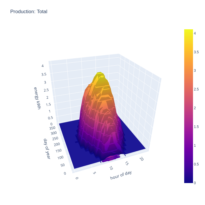
Seeing generation of each array separately is interesting in order to evaluate their relative performance. For comparison with consumption data though, a chart illustrating the combined generation of all arrays is more useful. This combined chart shows the south east and north west arrays complementing each other very well to expand the width of the peak generation time in the summer months, with peak summer output of 4kw per hour and covering the main hours of consumption. There is still useful improvement in the spring and autumn months, but winter is unchanged.
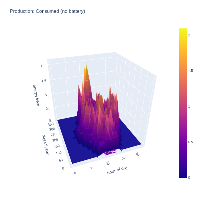
By taking the intersection of consumption and generation data, we can evaluate what subset of the generated energy is capable of being consumed at home, ignoring the possibility of battery storage. This chart shows the the generated energy can make a significant contribution to recorded consumption across the whole year. Obviously generated energy is only being consumed during daylight hours, since this chart discounts the usage of the any hypothetical home storage battery
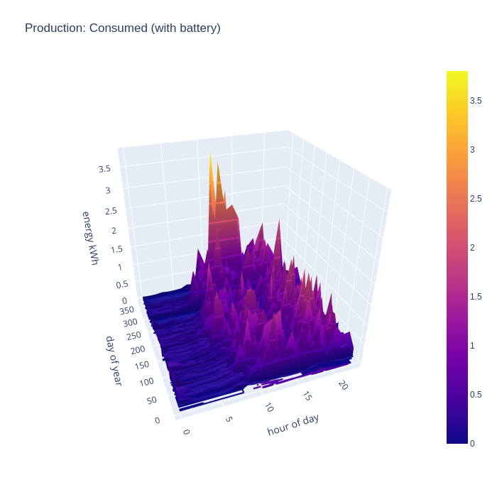
It gets more interesting when taking into account the battery storage. This new chart shows that the house can run from self-generated energy around the clock for most of the year, but it especially shows how the battery can “time shift” generated energy into the evening once daylight has faded, but the house still has significant energy needs and continues to supply the house throughout the night even for some days in winter.
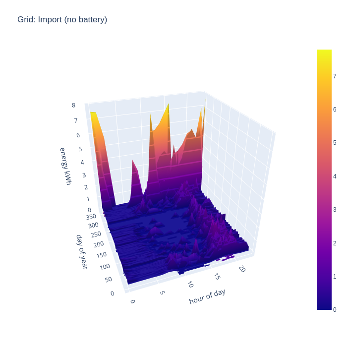
Another way of looking at the data is to consider how much energy is being imported from the national grid, as this indicates an inability to generate sufficient from the local PV arrays. First without the battery storage, it can be seen that in the middle of the day grid import is negligible outside of the winter months, but there is still considerable import in the evenings. The spikes from EV charging and temporary electric heaters are also still present. The winter months still show some significant grid import even in the middle of the day.
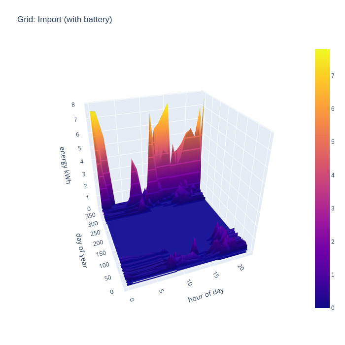
Adding in the battery storage calculations has a really dramatic impact on grid import. With 10kw of storage, there is enough buffer to be 100% self-sufficient in energy generation for 7 months of the year, which is a really astonishing result. A battery of this size obviously can’t address the peaks demanded by the EV charging periods, since the car battery capacity is well in excess of the home storage battery, but that’s to be expected.
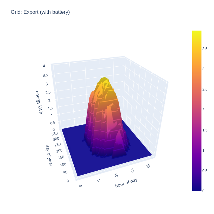
The total PV generation capacity over the year with the 16 panels is 5300 kwh while yearly consumption is only 3000 kwh, so clearly there is a lot of excess electricity going unused. To visualize this, a chart showing exports to the grid is useful to consider. Unsurprisingly, with no battery, we see strong grid export rates across all the day time hours when the panels are generating.

If we now add in the effects of a home battery, the grid export pattern changes somewhat. In winter months there is absolutely no grid export, with 100% of solar generation now able to be consumed locally, since demand far exceeds what is able to be generated in these months. In the rest of the months, export doesn’t start until an hour or two later in the morning. This shows the battery being recharged after overnight usage, until it is full and exporting of energy resumes.
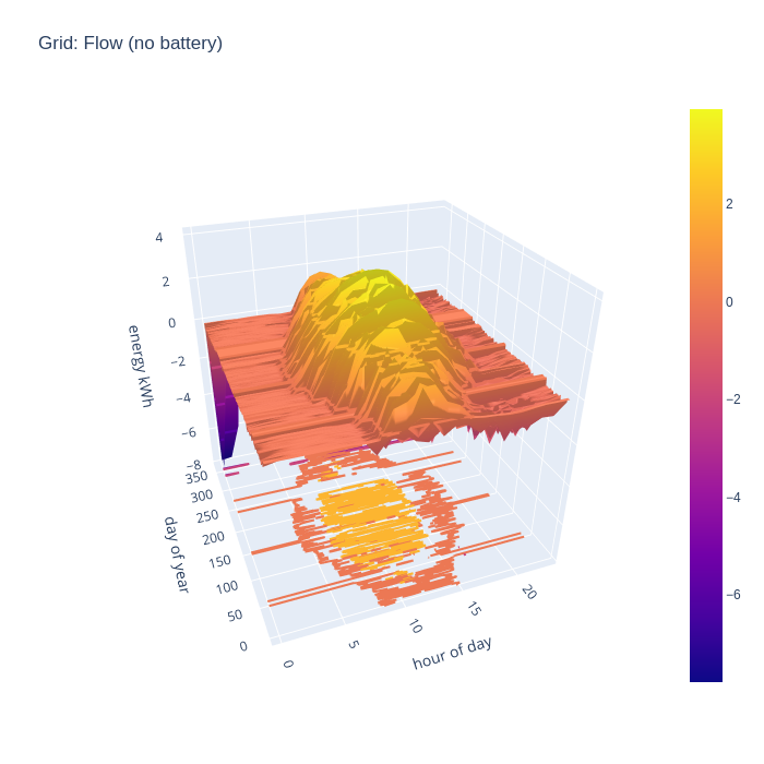
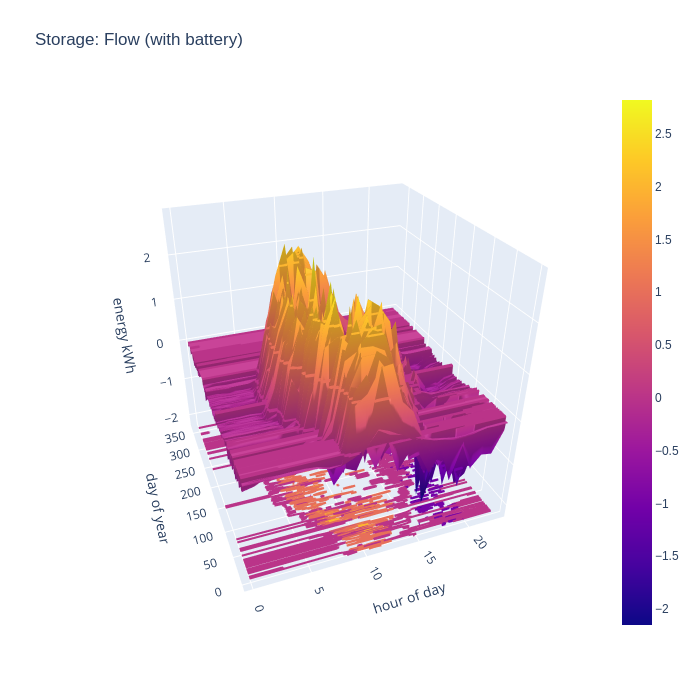
An alternative way to consider the grid import and export is to combine the two charts to illustrate the flow, with positive being export and negative being import. This nicely visualizes when the direction of flow flips during the day.
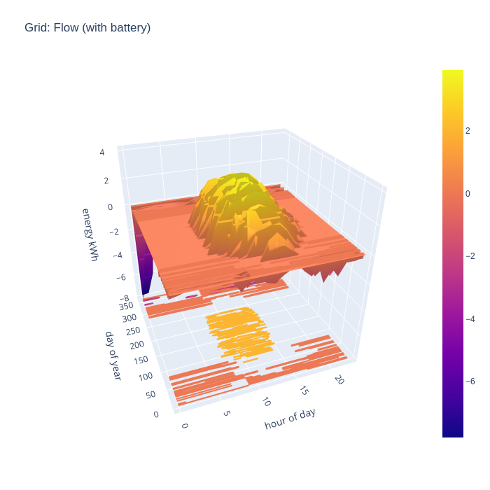
With battery storage taken into account, it is very apparent when there is neither grid import nor grid export during summer months.
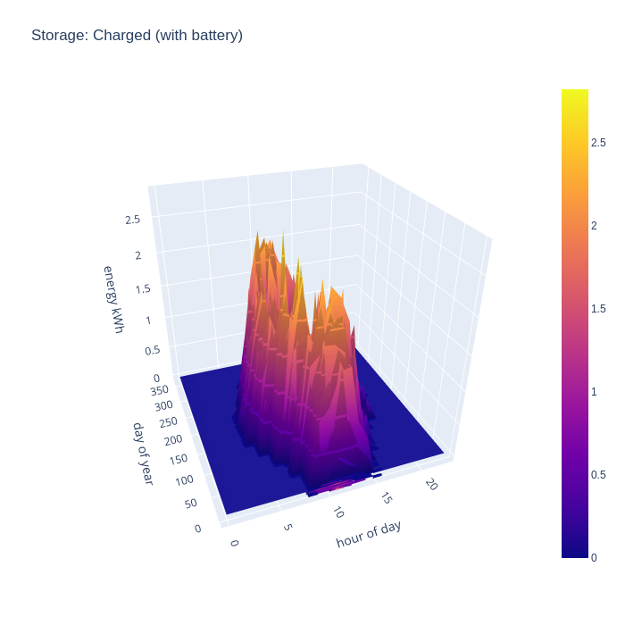
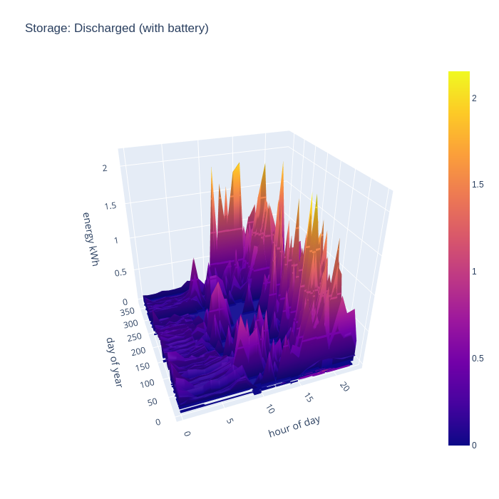
After considering the import and export rates for the grid, the final thing to look at is the charge and discharge rate of the battery storage. In terms of charging, the pattern broadly reflects the initial period of daylight hours throughout the year, as there is always either a slight mismatch in generation vs demand, or a huge surplus available. The battery typically fills up very quickly at the start of the day and remains that way for most of the day. This might suggest the need for a bigger battery, but the grid import chart shows that the house can run entirely from local consumption for 8 months of the year, an in winter months all PV generation is consumed, so there is not much to gain from a bigger battery.
The battery discharge pattern is perhaps the more interesting of the two charts, as it shows exactly when the benefit of the battery is most felt. In summer there are some peaks of discharge at the start of the day, this reflects some temporary loads which exceed the available generation, such as running the dishwasher or washing machine. In the middle of the day there is very little discharge except for winter months, but the evening is there is really shines. The solar PV generation has peaked, but there is still major consumption demand for cooking dinner on an electric induction hob, and/or oven, and the periodic use of a tumble dryer. Finally the battery takes up the load throughout the night when there is zero PV generation, but fairly low baseline demand.
Again the charge and discharge charts can be combined to show the flow in (positive) and out (negative) of the battery
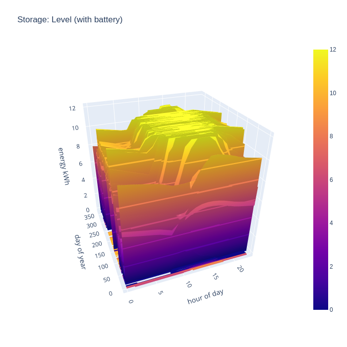
The final chart to look at is the battery charge level, which will give an idea of how well sized the battery is. If it never reaches a 100% full state, then it is likely oversized, but if it spends the whole year at 100% full state, then it is likely undersized. The ideal with be tradeoff somewhere in between, perhaps with a battery large enough to eliminate grid import for perhaps the middle 50% of the year, showing periods of strong charge and discharge.
With this walkthrough complete, the potential benefits of having fine grained electricity consumption data from smart meters is becoming more apparent. Having access to both consumption and generation data for your home and its location allows evaluation of an arbitrary number of different solar PV + battery storage deployment options, where a commercial installer might only show 2-3 scenarios at most.
There are still many limitations to the visualization that should be kept in mind
- The electricity consumption data reflects a point in time before solar PV is installed, and it is commonly reported that people tend to change their usage patterns to take most advantage of free electricity they’ve got available. IOW, the level of self-consumption in the no-battery scenario is probably understated, while the potential gain in self-consumption from adding a battery is slightly over-stated.
- The electricity consumption data reflects one year, while the PVGIS solar irradiation data is from a different year. Electricity consumption may well vary depending on weather, for example increased use of tumble dryers when it is cloudy and wet, or decreased use of ovens when it is hot. Or the year chosen for either consumption or generation data may have quirks that makes it non-representative of a typical year. It could be worth trying different years for the PVGIS data to see if it impacts the results produced. An enhancement would be for the tool to average PVGIS data from a number of years in particular.
- The data is being processed at 1 hour granularity, with an assumption that generation and consumption is spread evenly across the hour. In reality this does not likely line up so well, and so self-consumption in the no battery scenario is likely overstated. The with battery charts, however, are likely to be fairly unaffected as the battery will easily compensate for short term mis-matches in generation and consumption
- In houses with hot water storage cylinders, it is very common to fit a solar diverter, such that when there is excess generation, it will be used to heat hot water instead of being exported to the grid. Thus the level of grid export is likely overstated, and self-consumption understated. There is also no visualization of the reduction in gas bill from the use of free electricity to heat water instead of a gas heater. Thus the potential benefits from having home storage batteries will be overstated to some degree.
- In houses with EV chargers, it is also typical to divert excess generation into the car, so again the level of grid export is likely overstated and self-consumption understated. Again this will have the effect of overstating the benefits of a home stokrage battery.
- The generation figures don’t take into account losses from the equipment, or localized degradation from shading on individual panels
- The consumption figures don’t reflect potential future changes in usage. For example, if the gas boiler were to be replaced by a heat pump, demand in the winter months in particular would massively increase, and summer months would increase to some extent for heating of hot water. This might push towards oversizing the PV array in the short term.
Despite these caveats, the visualization should still be very beneficial in evaluating different solar PV and battery installation scenarios.
Leave a Reply